DATA SCIENCE
Visual Analytics as a Key to Help the Public Understand Pandemic Data
A visual understanding of the COVID-19 situation reduces feelings of panic and clarifies the logic of shelter-in-place or stay-at-home rules. It also helps maintain trust in government institutions.
By Kevin Kells, Ph.D.
Visualizing near-real-time data has played an important role in helping the public understand the situation of the COVID-19 pandemic and to help persuade members of our communities to choose behaviors that are better for them and, crucially, better for everyone in the community. Visualizing health system and case data is obviously important for health professionals and government authorities responding to the pandemic and for entrepreneurs and industry who can mobilize to fill gaps and needs. But for the public, situational awareness provided by audience-appropriate presentation of pandemic data is also very important.
A visual understanding of the situation reduces feelings of panic and clarifies the logic of shelter-in-place or stay-at-home rules. It also helps maintain trust in government institutions by demonstrating, with data, how individual sacrifices are paying off by establishing control over the virus spread. This trust is important, as eventually an isolated public, exhausted and frustrated, will need to follow the corresponding instructions as the pandemic comes to an end—be it a medical or a social end.[1]
Tell a Navigable Story with a Dashboard
Data Science offers a series of steps when dealing with a problem we’re trying to understand and solve: Describe, Diagnose, Predict, and Prescribe, usually undertaken in that order, with each subsequent step increasing in complexity and generally decreasing in the absolute certainty of the results.[2] This article will focus on the “Describe” step, where the factual data is collected, prepared, and then presented to the audience. Pandemic “models” that forecast the future spread of the pandemic virus, foresee future health system capacity, and simulate possible response scenarios fall under the “Diagnose”, “Predict” and “Prescribe” steps.
The goal of the Describe step is to provide clarity to the audience and to help them gain insights. One important aspect of this work asks where to obtain the data, how to ensure it is reliable, correct, complete, and up-to-date, and to annotate data sources, assumptions, caveats, and known inaccuracies. The other important aspect is: “How can we present this data to the intended audience in a way they can understand it?” Clarity and insights are human results we want to obtain, so it is about more than just having good data, but presenting it appropriately. In this case, the audience is the general public, so the way we present the data —both the content we choose and the design—must be simple, intuitive, and familiar. The common denominator for the general public is to tell a story visually and to let the audience interact and discover further details on their own.
The Coronavirus Resource Center web page dashboard (See the image below) hosted by the Johns Hopkins Centers for Civic Impact provides an example of design elements that have made this presentation very successful in the public and media. What makes this web page a good dashboard are: A) The entire contents are visible on a single, non-scrolling page, and B) A readable summary of all the important data are represented at once in about seven dashboard regions.[3]
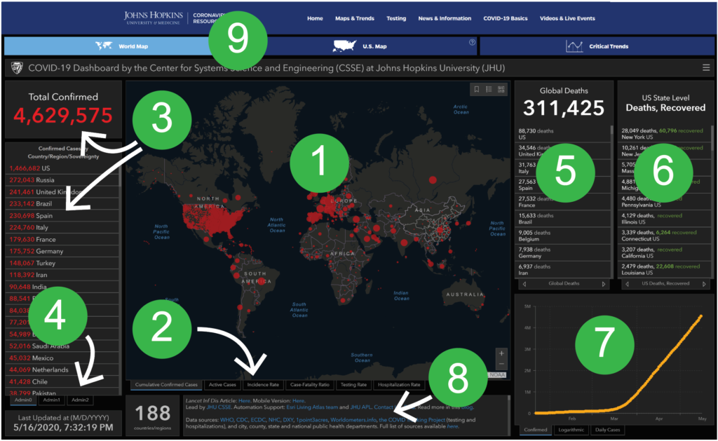
Aesthetics are important given the public audience. An evaluation of any data presentation should include a review of the aesthetics so that audience engagement is maximized via different means of human perception. The public audience responds readily to pleasing aesthetics of a presentation, including graphics, font choice, and color scheme; these are important factors in the success of the Johns Hopkins presentation.
The elements on the Johns Hopkins page are:
- A movable, zoomable world map with cumulative confirmed cases visually presented;
- The tabs at the bottom of the map permit the user to select different geographic datasets;
- The total confirmed worldwide case count with the confirmed cases by geopolitical subdivision;
- Different geopolitical subdivision schemes are available;
- Global deaths and recovered cases;
- US State level deaths, hospitalizations, and deaths;
- Global confirmed cases and daily new cases over time;
- Data sources, caveats, and explanations of terminology;
- Alternative scope (US instead of Worldwide data) and a Critical Trends presentation.
By clicking into a particular geographic area for more details, we find evidence that the dashboard is continually evolving and improving.
The graphic below is improved over the version. A multi-bar graph and a pie chart were replaced each by stacked bar charts. Pie charts are generally deemed poor graphical elements for presenting data because they are hard to read, they don’t have a scale, and because the brain is not as good at comparing angles as it is at comparing lengths.
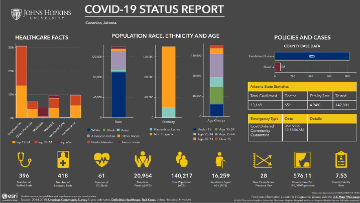
Web-based data visualization is easily changed, reconfigured, and improved. Even user behavior can be taken directly into account to make improvements. For example, if users continually click through to navigate to one certain detail, the display of that detail can be migrated to the main page to increase convenience and reduce mouse clicks needed to find that detail. Any major effort such as the Johns Hopkins COVID-19 dashboard should be accompanied by a process to receive, review, prioritize, and promptly take action on feedback and suggestions that are received both internally and from external users. The feedback-and-improvement process is an integral part of the effort; the setup of this process should be given due attention when organizing and managing such a data visualization effort.
Pandemic Dynamics and Exponential Thinking
As a final example of pandemic data visualization for the public audience we present visual explainers of pandemic dynamics as animated simulation tools. This animated production from the Washington Post, offered in a dozen languages, is graphical and animated. And fun—just what is needed to prompt self-directed engagement of a general, public audience in an educational activity. [4] [5]
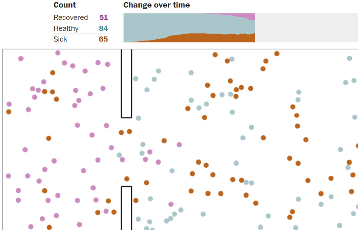
As members of the general public, we are used to thinking linearly compared with exponentially. When told, “the number of cases increases by 1,000 every three days,” we are able to grasp that fairly well. When told, “the number of cases doubles every three days,” which is the exponential growth characteristic of an unchecked pandemic, the implications are not readily grasped by the linear thinking process, nor is the crucial urgency of timely decision-making always readily apparent. In the linear case, one month later, the number of cases goes from 1,000 to 11,000. In the exponential case, it goes from 1,000 to 1 million.
If we can avert 1,000 cases from spreading the contagion, in the linear case, we’ll have 1,000 fewer cases after a month. In the exponential case, the same reduction of cases is achieved if we wait until the end of the month to avert them. But if we can avert those same 1,000 at the beginning of the month, we reduce by 500,000 the number of cases at month’s end, solely due to the nature of exponential growth. [6]
Engaging the Public Audience with Analytics
Communicating data to the general public requires simplicity, aesthetics, interactivity, and the creation of a visual story that is intuitive and familiar. In contrast to academic and professional publications, the burden of good communication is much more on the communicator, where successful conveyance is a function more than of having good data, but of communicating it well.
A dashboard approach to presenting data such as the Johns Hopkins Centers for Civic Impact’s Coronavirus Resource Center web page offers the public a single location where they can turn to obtain the most frequent details they seek on one main web page that requires no scrolling. Careful selection of about seven dashboard elements, continually improved and adapted to reflect feedback received, permits users to interactively navigate in a familiar way to find details. The aesthetically pleasing, visual representation of the data captures the public user’s attention and leads to improved understanding by encouraging their engagement.
Additional tools such as animated simulations provide the general public interactivity and the element of fun, important to encouraging exploration and engagement.
This pandemic has bridged the sphere of individual behavior and liberty and the sphere of community life and health in a very stark way that is a new experience for most of us. The exponential nature of pandemics makes it harder for the general public to understand the logic of certain government decisions such as lock-downs, though they may be mathematically wise. Reflecting the data back to the public as a story they can understand and explore in a way to help bridge the communication gap that often exists.
- Gina Kolata, May 10, 2020, “How Pandemics End”, NY Times
- Boyer, A. & Bonnin, G. (2016). “Higher Education and the Revolution of Learning Analytics”
- Miller, G. A. (1956). “The magical number seven, plus or minus two: Some limits on our capacity for processing information”. Psychological Review.
- Villagrasa, S., Fonseca, D., Redondo, E., & Duran, J. (2014). “Teaching Case of Gamification and Visual Technologies for Education”. Journal of Cases on Information Technology.
- Hamari, J., Koivisto, J., & Sarsa, H. (2014). “Does Gamification Work? – A Literature Review of Empirical Studies on Gamification.”
- Siobhan Roberts, 2020-03-13, “The Exponential Power of Now”, NY Times Science
About The Author

Kevin Kells. Ph.D.
Kevin has worked as an R&D Engineer in software systems in the Financial and Semiconductor industries in Switzerland, Silicon Valley, and Ottawa, and currently works with real-time data and news feed systems at a major market news and data company in New York City. He also has extensive experience in non-profit management, both in the area of human systems and IT systems. He received his PhD from the Swiss Federal Institute of Technology (ETH), Zurich in computer simulation of semiconductor devices and holds an MBA with areas of focus in entrepreneurship and business analytics from the University of Ottawa, Telfer School of Management.